• Work
  • About
  • Blog
  • Contact
Joshua Berman Design
  • Work
  • About
  • Blog
  • Contact

Case Study: Eagles View Church

A young church outside of Fort Worth, Texas, Eagles View Church is a small congregation with services and ministries engineered specifically for young families. Much of the new curriculum being developed by EVC encourages these families to get together outside of the usual service times, and help create a tight-knit community. I worked with the associate pastor in charge of this curriculum development, as well as the senior pastor and youth minister, to develop an accompanying brand for the church's bold vision.

The Brief

There were two distinct goals of this project. The first was raising general community awareness in the Saginaw area, and the second was simple visual improvement over the current logo. I aimed to kill two birds (no pun intended) with one stone.

I found many people, when asked what "Eagles View" was, were not aware that it was a church. Although many were not aware that the church existed at all, the current shorthand for the church was simply "Eagle's View," which did not give any indication that the church was, in fact, a church.

This anonymity issue was further exacerbated by the church's location. Saginaw, Texas is home to Eagle Mountain Lake, and many local companies in the area have the word "eagle" in the name. Given the abbreviated name for the church was already something common, and the option of renaming quickly disqualified, I was left with the challenge of addressing what the church's nickname.

I asked why "Eagles View" was the common shorthand, and when no answer could be found, aside from convenience,  I visited the church and found this old logo displayed on the side of the building.

Old Logo

evc_old_logo
evc_old_logo

Aside from the myriad of design troubles, like ineffective reproduction in one color (a common trouble with the church secretaries, who usually do all the reproduction), the word "church" was minimized in comparison to the word's "Eagle's View" and further obscured by the background bar. The logo did not show up this way in all its forms, but the issue was a common one.

So the first goal for me was to put the word "church" on an even playing field, but that leaves quite a mouthful to say. "EVC" was a sometimes-used nickname for the church, but the decision was made to promote it to full-time.

Another frustrating element was the apostrophe. This was used inconsistently on the web and in print, so the decision was made to remove it altogether. The use of a literal eagle was also quite common in the region, but I kept it as an option in case of an excellent idea.

Creative Development

The target market for EVC, as already discussed, is young families. The general member age is from 25-45, into which young families fit nicely. The recent explosion of suburban housing developments in the area is a boon for this growing congregation.

Although this information is highly useful in marketing campaigns, it also gives me some visual cues to take. I wanted the identity system to be friendly, but structured. A hand-scripted cursive for the icon, and a recognizable sans-serif give the logo that combination

Visually, the focus is giving the three words eagles, view and church, equal playing time. By making the new shorthand, EVC, into the icon, I could then reduce the current logo's four elements, the swoosh, the eagle, the title (Eagle's View) and the subtitle (Church) down to two: an icon featuring the nickname, and a title with the whole name. The use of EVC in the icon is essential to bringing the new shorthand into common use, especially since it will be used on its own in many cases.

New Logo

evc_new_logo
evc_new_logo
evc_new_logo_2
evc_new_logo_2

Branding Guide

The use of a guide is specifically useful to EVC. They have many different people reproducing the logo in various forms, and this can mean a variety of abuses. I developed a system by which users of the logo elements can steward its use with care.

Click here to view the EVC Branding Guide.

The response to the new logo has been excellent, and the accompanying branding guide has eliminated the issues the church was previously facing with logo variation and mis-use.

The new face of EVC is making itself known in Saginaw, Texas.

categories: Branding, Case Studies, Non-Profit
Saturday 11.10.12
Posted by Joshua
 

Nickelfish Internal Projects

As many of you know, I had a wonderful experience working at Nickelfish, and left it for my new home in North Carolina a few months ago. While cleaning out old project folders on my computer I uncovered a few internal projects that never quite made the portfolio...

N.I.P.P.S

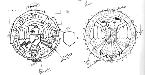
The National Identity & Publication Protection Service is an internal project designed to poke fun at government agencies / design firms that tend to defend the status quo. This was only one part of a larger ad campaign, but the mark we invented was pretty fun.

jbd_blog_nfidm_3
jbd_blog_nfidm_3
jbd_blog_nfidm_2
jbd_blog_nfidm_2
jbd_blog_nfidm_1
jbd_blog_nfidm_1

League of Heroes

If you've been to the Nickelfish website, you've seen the image of the staff as their superhero alter egos. We invented a logo to use with these characters, but it has yet to be utilized in its fullest form.

jbd_blog_nfidm_4
jbd_blog_nfidm_4
jbd_blog_nfidm_5
jbd_blog_nfidm_5

Bombadil Battalion

Shortly before I left, Nickelfish split their staff into three production teams, each with some sort of hilarious name. Our team name was Bombadil Battalion, after the famed Tom Bombadil of The Fellowship of the ring. A team logo was also charged, and I included the feathered cap, beer stein, and music note as symbols of our patron saint.

jbd_blog_nfidm_6
jbd_blog_nfidm_6

Blowing Minds Since 2002

This last project was simply a t-shirt design we developed for our own team. Internal stuff like this is usually a ton of fun, and every once and a while you have to work on something that distracts from the day-to-day.

jbd_blog_nfidm_7
jbd_blog_nfidm_7
jbd_blog_nfidm_8
jbd_blog_nfidm_8
categories: Apparel, Logos, NFIDM
Thursday 07.26.12
Posted by Joshua
 

David Adrian Smith

I do not frequently write about the work of other artists. There are dozens and hundreds and thousands of blogs dedicated to featuring the work of fine visual artists, artisans and their like, and I subscribe to many of them. But this blog is not that. However, every once and a while I see an artist whose work so blows me away that I simply must comment on it. Ladies and gentlemen: David Adrian Smith.

david_adrian_smith_glass_2
david_adrian_smith_glass_1

From his own site...

Dave Smith is a name that has become synonymous in sign-writing circles with high quality, hand crafted reverse glass signs and decorative mirrors. It is fair to say that now-a-days this is the main thrust of his work. There is, however, more to his story.

His career in sign-writing began in 1984, when he left Westlands School in Torquay, aged 16 and was apprenticed for 5 years with Gordon Farr & two associates. These gentleman were traditional sign-writers, who had come up through the ranks and Gordon, in particular had an almost uncanny ability to paint letters, accurately laid out, without even a preliminary sketch. Under their tutelage, Dave became an accomplished draftsman, accurate letter painter & talented pictorialist...

I first became aware of David A. Smith only a matter of weeks ago, when I saw a link of his work on the new John Mayer album art.

david_adrian_smith_born_and_raised

Here is one of him sketching the album art.

david_adrian_smith_sketching

While I cannot post every image from his site that I would like, I can encourage you to go check out his work on his website. His process and quality are truly inspirational, and make me strive to produce better and better images. I do not know that I have ever felt so inadequate in my own design work as after watching this video.

On another note, I know I haven't updated the portfolio area with new work in quite a while, but I hope to be remedying that soon. Many new projects have been taking place with The Brandit, and consume the vast majority of my design time. I'll be sure to alert you when I do.

categories: Lettering, Process, Recommendations
Thursday 06.21.12
Posted by Joshua
 

The Northern Logo

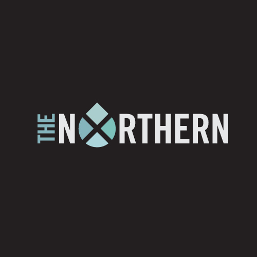
Graham Gibson, Jon Ho, Aaron Craig, David Chalk are musical group The Northern. This Manhattan rock and roll quartet of misplaced Texans releases their new album, The Shadowlands, on June 15th in NYC. If you are interested in going, check out their respective webbed sites for more information:

jbd_blog_the_northern_logo

The Northern on Twitter: twitter.com/thenorthernnyc The Northern on the Web: thenorthern.com/ The Northern on Facebook: facebook.com/TheNorthernMusic

On their blog you can see this new post about the logo. I had better get a shirt or something for this.

The Shadowlands releases on iTunes June 19th.

categories: Logos
Wednesday 05.16.12
Posted by Joshua Berman
Comments: 1
 
Newer / Older

WORK  |  ABOUT  |  BLOG  |  TESTIMONIALS  |  CONTACT  |  COPYRIGHT JOSHUA BERMAN 2016