• Work
  • About
  • Blog
  • Contact
Joshua Berman Design
  • Work
  • About
  • Blog
  • Contact

T-Shirt Design & Logo Roundup - Summer 2017

With the oppressive heat in full swing, it's time to break out your favorite tees. Apparel is not something of which I do an enormous amount, but it's always a good time. Here are a few of my favorites from the past several weeks/months/years.

Barley's Craft Pizza & Beer
Greenville, SC

King's Sandwich Shop
Durham, NC

Key West Pub Crawl 2015
Funky Buddha Brewery
Oakland Park, Florida

Oconee Brewing Co.
Greensboro, Georgia

Euro-Awesome 2015
Personal Project

"Courage!"
Santa Maria Brewing Co.
Santa Maria, California

Hoke Family Reunion 2017
Cleveland, Ohio

King's Sandwich Shop
Durham, NC

Maple Bacon Coffee Porter Festival
Funky Buddha Brewery
Oakland Park, Florida

Iron Triangle Brewing Co.
Los Angeles, California

Silver Harbor Brewing Co.
Saint Joseph, Michigan

"Ales & Lagers"
Santa Maria Brewing Co.
Santa Maria, California


Funky Buddha, Barley's, Iron Triangle, Oconne, and Silver Harbor. were all done while I was at The Brandit, but not all of these shirts were ever produced. Sometimes it's fun to see what might have been.

tags: apparel, t-shirts, t-shirt design, beer, branding, beer design, beer branding, graphic design, custom t-shirts, custom t-shirt designs
categories: Apparel, Design, Illustration, The Brandit, Cutting Room Floor
Tuesday 07.25.17
Posted by Joshua Berman
 

Nickelfish Internal Projects

As many of you know, I had a wonderful experience working at Nickelfish, and left it for my new home in North Carolina a few months ago. While cleaning out old project folders on my computer I uncovered a few internal projects that never quite made the portfolio...

N.I.P.P.S

The National Identity & Publication Protection Service is an internal project designed to poke fun at government agencies / design firms that tend to defend the status quo. This was only one part of a larger ad campaign, but the mark we invented was pretty fun.

jbd_blog_nfidm_3
jbd_blog_nfidm_3
jbd_blog_nfidm_2
jbd_blog_nfidm_2
jbd_blog_nfidm_1
jbd_blog_nfidm_1

League of Heroes

If you've been to the Nickelfish website, you've seen the image of the staff as their superhero alter egos. We invented a logo to use with these characters, but it has yet to be utilized in its fullest form.

jbd_blog_nfidm_4
jbd_blog_nfidm_4
jbd_blog_nfidm_5
jbd_blog_nfidm_5

Bombadil Battalion

Shortly before I left, Nickelfish split their staff into three production teams, each with some sort of hilarious name. Our team name was Bombadil Battalion, after the famed Tom Bombadil of The Fellowship of the ring. A team logo was also charged, and I included the feathered cap, beer stein, and music note as symbols of our patron saint.

jbd_blog_nfidm_6
jbd_blog_nfidm_6

Blowing Minds Since 2002

This last project was simply a t-shirt design we developed for our own team. Internal stuff like this is usually a ton of fun, and every once and a while you have to work on something that distracts from the day-to-day.

jbd_blog_nfidm_7
jbd_blog_nfidm_7
jbd_blog_nfidm_8
jbd_blog_nfidm_8
categories: Apparel, Logos, NFIDM
Thursday 07.26.12
Posted by Joshua
 

Princeton vs Michigan

jbd_blog_wingedhelmet_1

Having lived in Princeton for over two years I decided it was about time to go see a Princeton Tigers' football game. With all due respect to some remarkable individual efforts including a Princeton outside linebacker, their kickoff return man, and a few Yale offensive playmakers, the game as a whole left much to be desired for someone whose football tastes were cultivated in Texas and Oklahoma.

A student of team sports uniform design, the most interesting part of the game was Princeton's winged helmet. If you have been aware of college football at any point in the last fifty years or so you will doubtlessly know of Michigan's famous winged helmet. I asked one of the Tigers' old guard seated behind me who had it first, and he assured me it was his alma mater.

jbd_blog_wingedhelmet_3

Princeton

Not that I didn't trust the homer sitting behind me, but this merited some research. Here is the story according to Princeton.edu:

"Princeton's orange and black "Tiger Helmet" is a distinctive piece of the University's sports tradition. Designed by legendary Hall of Fame coach Herbert O. "Fritz" Crisler and first worn by the undefeated national championship team of 1935, this colorful headgear is a link to one of the great eras in the heralded football history of Old Nassau.

"The helmet was styled to represent a fighting tiger with its ears glared back and three symbolic orange-stripes running sleekly from front to back and matches the traditional tiger striping on the jersey. At a time when all helmets were similar, Coach Crisler thought that this highly visible emblem would help quarterbacks more readily find their downfield receivers.

"When Crisler left Princeton in 1938, he took the helmet design with him to Michigan, where in maize and blue it became an icon of that university's football program. This distinctive helmet design which originated at Princeton - where intercollegiate football was born - is a reminder to students, alumni, fans and worthy opponents of all the great Tiger players who ever proudly represented Old Nassau on the gridiron." -Princeton.edu

Surprisingly, Michigan's website supports this narrative:

jbd_blog_wingedhelmet_7

Michigan

"The famous "winged" design dates from 1938 when Coach Herbert O. "Fritz" Crisler arrived from Princeton to begin a new era in Michigan football. Even as the design and composition of helmets evolved from stitched cowhide to high-tech, molded plastic, the winged design has remained the pre-eminent symbol of Michigan football.

"The distinctive helmet would also have practical advantages on the field. Crisler figured the helmet would help his halfbacks find receivers downfield. 'There was a tendency to use different colored helmets just for receivers in those days, but I always thought that would be as helpful for the defense as for the offense,' Crisler recalled." - Bentley Historical Library

Here is an interesting video about the Michigan helmet reconditioning process. Although it is heavily pro-Michigan, the fact remains that their helmet is certainly the most recognizable in the college sports landscape.

However! As it turns out, there is more to this story. Ohio State University claims to have used a "winged" design as early as 1930:

jbd_blog_wingedhelmet_6

Ohio State

"On September 11, 1930, Ohio State Head Coach Sam Willaman had his Buckeyes debut new uniforms along with winged helmets at Northwestern. This was the first time any team, either college or professional, wore a winged helmet.

The first winged helmet was a dark leather helmet with a lighter contrasting color wing on the front. The wing was put in place as extra padding to help sustain collisions.

Willaman had his teams wear the winged helmet for three seasons and in 1934, new Head Coach Francis Schmidt kept the winged helmets for his first season, but opted to return to the traditional leather helmets during his second season in 1935." - SpartanJerseys.com

The reason this is not as popular a narrative, however, is due to the nature of the "wings" on the helmet. The uniqueness of the Princeton/Michigan design includes the three stripes coming out of the center front of the wings, and wrapping around the head to converge in the back. However! Photographic evidence proves that the "three striped winged helmet" had been used even prior to Crisler's 1935 Princeton team.

jbd_blog_wingedhelmet_4

Indiana

"In 1933, Indiana started wearing winged helmets under Head Coach Earle "Billy" Hayes with a victory over Miami (OH) on September 30, 1933.Indiana’s winged helmet consisted of a black leather helmet with a white wing and three white stripes running from front to back. A small block “I” logo was centered on the front of the wing.

"In 1934, Indiana hired a new head coach, Alvin "Bo" McMillin, who began phasing out the winged helmets only one year after the helmets were debuted at Indiana. Photos of the team and games depict only half of Indiana’s players wearing winged helmets during this season, with the other half wearing the traditional leather helmet. This suggests the NCAA and Big Ten rules regarding consistency with helmets were more flexible in 1934.

"By 1935, the entire team switched back to traditional leather helmets ending their two-year stint wearing the winged helmets." - SpartanJerseys.com

Spalding's FH5 three striped winged helmet featured on the cover of the 1938 Spalding Official Intercollegiate Football Guide:

jbd_blog_wingedhelmet_5

So as it turns out Princeton was not the first utilize to utilize either a winged helmet or the three striped winged helmet design. The Michigan State Spartans page has a more robust history on it than mine, including excellent academic sources in case you don't want to take my word on any of this.

I might buy what they have to say since Michigan State no longer uses a winged helmet design and doesn't stand to loose anything. However, with Michigan being their biggest rival, it might behoove them to discredit one of Michigan's coaches with the creation of it... conspiracy?

Although Princeton abandoned the winged helmet when Crisler left after the '37 season, the Tigers resurrected it in 1998 and use it to this day. Upon further research (read: Wikipedia) I found an abbreviated record of other schools who have used the design:

  • Saint Peter's College, New Jersey (football program since dropped)
  • University of Delaware
  • Southwest Baptist University (stopped its use in 2008)
  • Grove City College
  • Gustavus Adolphus College
  • Middlebury College
  • Nichols College
jbd_blog_wingedhelmet_2

This topic definitely merits more research than the cursory web search I've done here, but it's certainly enough to whet my appetite on the unique headgear. In case you're interested here is the Wikipedia page on the history of the winged helmet design. I won't be posting again before the new year, so enjoy your holidays and the remainder of 2011.

See you all in 2012.

categories: Apparel, Team Sports Identity, Thoughts + Opinions
Saturday 12.03.11
Posted by Joshua
Comments: 7
 

Case Study: Bethesda Christian School

I attended Bethesda Christian School from 1st grade through high school graduation. I made some excellent friends, many I have to this day, and my mother has been a standout elementary educator there for close to two decades. I was approached by BCS to help design a mascot costume for the school. Bethesda's nickname is "Ambassadors," which perfectly captures the mission of the school but is something less than inspirational for a sideline character at basketball games.

Note: Sometimes the words "mascot" and "nickname" are used interchangeably, but they are really two different things. A mascot is the costumed character or animal roaming the sidelines at sporting events, like Reveille at Texas A&M. A nickname is what you call the sports team or fan base, e.g. the Aggies.

It was evident early on that the entire Bethesda visual identity needed evaluation. The school has a strong reputation in its circles, but has experienced difficulty with visual consistency during its 30 year run as one of the best private schools in the Dallas/Fort Worth area. As of this time last year BCS was employing around a dozen images, icons, pictures, and logotypes to make up the visual brand of the school, for both athletics and academics.

Adding a costumed character on the sidelines would simply convolute an already confused system. I took it upon myself to unify the entire athletic identity, and redesign the academic identity in concert. But we had to start at the top...

Note: This is a large project with many moving parts. The length of this post reflects the careful thinking behind this detailed and robust solution.

The Brief

Bethesda had recently adopted a new icon for use on promotional materials: a lion's head with continents in it. It was probably the best-designed logo Bethesda has ever had, as the seal they utilized for over two decades was a clip-art contraption made on a whim by a t-shirt guy for an early school event.

The lion's head was inspired by an equally inspiring painting in the school's hallways, and its appearance in the school's marketing materials birthed waves of "Are we changing our nickname to the lions?" and "Why don't we have that on our jerseys and t-shirts?"

These were also my first questions to Bethesda, and after prolonged conversations with the leadership, it was decided that Ambassador was to endure and, in-spite of hundreds of newly minted promotional folders, lion's head logo and it's colorful character shield would not be long for this world.

Old Academic Logos

jbd_blog_bcs_intro_1.jpg

At this point I would like to make a quick distinction between the "academic" and the "athletic" brands. It is expected for an educational institution to have a seal or logo that is used on academic or professional materials, and a separate logo that is used on uniforms and fan gear, and sometimes marketing materials.

As student-athletes at BCS, we were often asked by other teams what an ambassador was. They were not asking literally, they just wanted to know why it was our nickname. We didn't have a good (read: short) answer, and it was a little frustrating as a student not having a visual representation as a mascot.

As you can see below, Bethesda's athletic brand elements were as confused as their academic logos. Most uniforms are simple enough, just school colors with the name, but there existed troubling spots, such as baseball and softball caps, one year sporting a "B" and the next year "A's" and the next "BCS."

Old Athletic Logos

jbd_blog_bcs_intro_2.jpg
jbd_blog_bcs_intro_3.jpg

The top images you see here were ripped straight from the Oakland Athletics and the Duquesne Dukes, and while it's not uncommon for high schools and junior clubs to borrow logos from pro teams, these were not in wide use, nor do they convey "Ambassador."

During the school's early years, the color scheme was white and royal blue. Gold was later added. Gold is an especially troublesome color for any organization, but especially so for a school. Schools have uniforms, apparel, printwork, marketing materials, websites and vehicles, and displaying a consistent shade of gold on all these surfaces becomes very tedious.

During my time at BCS I wore old gold, vegas gold, lemon yellow, mustard, beige, and classic yellow, all of which were supposed to be the BCS "gold." Unfortunately, I do not have pictures of all these shades.

Only a handful of academic institutions have done this color well, and the key is establishing which "gold" you want to use. The University of Minnesota is a great example of effective gold selection, the Golden Gophers always sporting the same shade:

minnesota.jpg

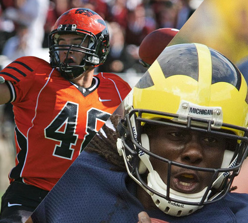
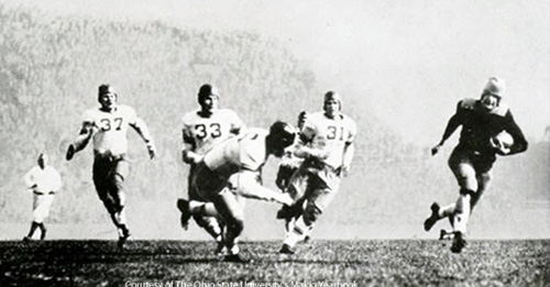
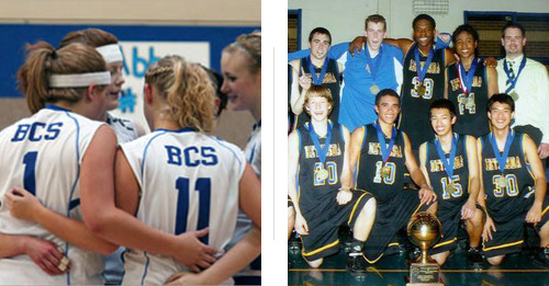
As you can see in the earlier BCS team photo, black was also added to certain team uniforms. Black is not a BCS school color, and so this decision came as a surprise to the leadership of the school. Uniform ordering decisions were left to individual coaches at that time.

_  _  _  _  _  _  _  _  _  _  _

The goal of this project was unification of the entire Bethesda brand: ensuring  the academic elements and the athletic elements worked together and helped convey the Ambassador concept. But, as with all schools (small, private schools especially) the primary consideration through the process was budget...

Creative Development

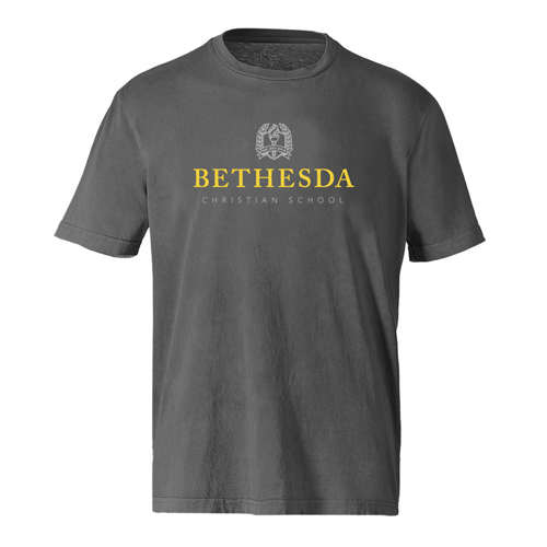
What good is selecting unique colors, designing custom typefaces and making gradient-heavy, detailed illustrations if the client cannot afford to implement them? Team uniforms at a school like BCS are purchased from catalogs, not custom stitched and printed to match specific Pantone values. Neither are the jersey typefaces. School stationery and letterhead is not gold foil stamped and embossed, and t-shirts for students get two colors at best.

Design might be king, but budget is queen.

Although it felt like putting the cart before the horse, a handful of budget-based decisions could effectively be made at the beginning (before pen touched paper) which would allow me to design a system that required no watering down when the rubber hit the road, so to speak. Some guidelines:

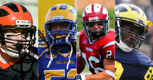
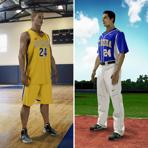
      • The school colors have to be available from the uniform supplier: Nike. Nike has four blues available, two yellows and one "vegas gold." We selected Nike Royal Blue and Nike Team Gold, which is really a bold yellow color similar to what the school had been using on uniforms when it could find it. We also removed the recently acquired black from the color scheme:one less moving part.
      • The school typefaces must be available from the uniform supplier. The font that is most widely available across different sports uniforms is a college block font in the "Vertical Arch" configuration.
      • The school logos must be primarily successful in one color. Much of BCS's recognition outside of campus has come from apparel, team uniforms and other merchandise, not the web. This means no gradients or use of color values in the logo execution, as well as bold, strong linework.

_  _  _  _  _  _  _  _  _  _  _

These decisions gave me some clear parameters before I even got started, but the primary question hadn't even been addressed. How do we visually convey ambassador? We needed a clear symbol representing the concept.

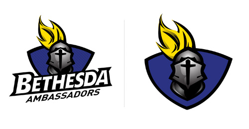
At various points in the past, including my time in high school, BCS had briefly played with a medieval character: a knight with a sword and shield. After much deliberation and multiple attempts to adopt a knight as the visual representation for the ambassadors, the concept was passed over for a few reasons:

1). The military nature of the character is not in sync with the mission of the school and their understanding of what it means to be an ambassador.

2). BCS wanted a visual identity that was unique amongst its peers. This is something an armored warrior does not provide, as Bethesda's competitive landscape is overcrowded with knights and warriors, saints and crusaders.*

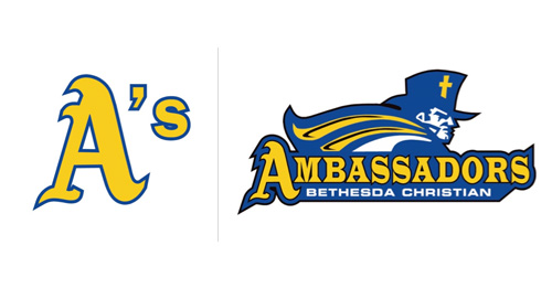
What symbolizes the heart of an ambassador, and is as utterly unique in the high school design landscape as the nickname ambassador itself? The answer was already in the school's alma mater... "the torch of truth shines forevermore."

Now the students can easily answer the question "What's an ambassador?" simply: a torchbearer.

And honestly, the torch is a pretty awesome icon. It is very common in academic circles, but never seen in the world of athletics (outside of the Olympics). It is the perfect one-two punch: the torch positions the school as the college-prep institution it is by visually equating BCS with institutions of higher learning and it distinguishes the athletic department from all competition with an icon that is entirely unique.

A torch it is.

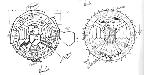
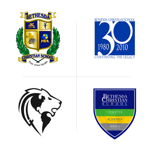
Although the origin of Bethesda's brightly-colored seal was dubious, it was highly symbolic to the staff and students and had become beloved over the decades. Rather than turning our backs on everything Bethesda had built to date, we elected to keep the shield as an integral part of the new logo system, both for academics and athletics. Time to sketch...

I wanted to keep the academic identity and athletic identity linked, but with different styles as suited to their purposes.

jbd_blog_bcs_31.jpg

The logotype in current use had Bethesda Christian as the primary text, with School as the subtitle. We reversed it, going back to the original seal, with Bethesda as the headline, and Christian School as the subhead.

The athletic look was a little different. You can see below that I began sketching before the "no-custom typeface" conclusion came into play. A custom typeface would only be able to show itself on the website and spiritwear, but not where the game is really going on: on the court.

jbd_blog_bcs_16.jpg
jbd_blog_bcs_21.jpg

The New Bethesda Brand

After much consideration (and probably too much throat clearing) I present to you the new visual identity for Bethesda Christian School.

New Academic Logo

jbd_blog_bcs_51.jpg
jbd_blog_bcs_71.jpg
jbd_blog_bcs_101.jpg

New Seal

jbd_blog_bcs_41.jpg

I used Adobe Caslon Pro (I tweaked it slightly for the Bethesda title), a typeface the school would already have access to, so they could use it to their own ends when necessary.

Academic Logo Color Variants

jbd_blog_bcs_81.jpg
jbd_blog_bcs_91.jpg

The athletic system was a different beast altogether. Selecting a typeface from the Nike catalog and streamlining it into a standalone mark was the simple part. The linchpin of this athletic identity is the bold treatment of the same torch-in-shield.

New Athletic Logos

jbd_blog_bcs_151.jpg
jbd_blog_bcs_61.jpg
jbd_blog_bcs_111.jpg

Athletic Logo Variants

jbd_blog_bcs_141.jpg
jbd_blog_bcs_121.jpg
jbd_blog_bcs_131.jpg

Apparel

A nice source of financial support for the athletic department is apparel, or "Spirit Wear." The single-color nature of the new designs allows for inexpensive but elegant printing.

New Bethesda Spirit Wear

jbd_blog_bcs_shirt_4.jpg
jbd_blog_bcs_shirt_3.jpg
jbd_blog_bcs_shirt_2.jpg

New Bethesda Athletic Spirit Wear

jbd_blog_bcs_shirt_1.jpg
jbd_blog_bcs_shirt_6.jpg
jbd_blog_bcs_shirt_5.jpg

Uniforms

The boys basketball team won state a few years ago, which has helped put the school on the athletic map. The championship team did so in black uniforms, which is a big no-no in the new system, but the coaches will not be making large design decisions from now on. The new design allows for classic jersey designs, without custom elements, that feature all-white home jerseys, blue aways, and yellow alternates.

The type treatment on the logo is now consistent with the font Bethesda uses from their uniform manufacturer.

New Bethesda Uniform Designs

jbd_blog_bcs_bbuni_white.jpg
jbd_blog_bcs_bbuni_blue.jpg
jbd_blog_bcs_muni.jpg
jbd_blog_bcs_wuni.jpg

Mascot Design

The mascots, although originally the first thing assigned, ended up being the last element designed. However, we settled on something pretty awesome.

Our torchbearers became "Olympic Superheroes" of sorts. On their costumes you will see round discs instead of shield shapes, because we abandoned the shield in favor of a globe at the end of the project.

jbd_blog_bcs_mascot_b.jpg
jbd_blog_bcs_mascot_g.jpg

Each character would have a breastplate with their costume; one character bearing a torch, and the other a shield, which could be joined together.

Conclusion

Although the content of this post is more than enough to fill a case study, I elected to write it in blog format for a few reasons.

As this work neared its completion certain events altered the nature of the project so significantly that an entirely new system would need to be created from scratch. The church that governs BCS began an extensive identity redesign project about half-way through ours, and wanted to fold the school into it, nullifying our work. Also, some significant staff changes took place that affected the trajectory of the athletic designs.

I did not participate in the new project, however, I believe the thought processes behind the project merits discussion.

Although I am disappointed my work was not used, I hope the logic behind the designs helped fuel the school's pursuit. Here are the new logos Bethesda has officially adopted:

bcs_new_logos.jpg
bcs_new_logos_athletic.jpg

*Note: Bethesda has since reversed this stance, and chosen a helmeted knight as its primary athletic logo.

categories: Apparel, Branding, Case Studies, Logos, Non-Profit, Team Sports Identity, Cutting Room Floor
Thursday 07.21.11
Posted by Joshua
Comments: 9
 
Newer / Older

WORK  |  ABOUT  |  BLOG  |  TESTIMONIALS  |  CONTACT  |  COPYRIGHT JOSHUA BERMAN 2016