• Work
  • About
  • Blog
  • Contact
Joshua Berman Design
  • Work
  • About
  • Blog
  • Contact

Nickelfish Internal Projects

As many of you know, I had a wonderful experience working at Nickelfish, and left it for my new home in North Carolina a few months ago. While cleaning out old project folders on my computer I uncovered a few internal projects that never quite made the portfolio...
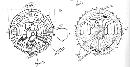
N.I.P.P.S

The National Identity & Publication Protection Service is an internal project designed to poke fun at government agencies / design firms that tend to defend the status quo. This was only one part of a larger ad campaign, but the mark we invented was pretty fun.

jbd_blog_nfidm_3
jbd_blog_nfidm_3
jbd_blog_nfidm_2
jbd_blog_nfidm_2
jbd_blog_nfidm_1
jbd_blog_nfidm_1

League of Heroes

If you've been to the Nickelfish website, you've seen the image of the staff as their superhero alter egos. We invented a logo to use with these characters, but it has yet to be utilized in its fullest form.

jbd_blog_nfidm_4
jbd_blog_nfidm_4
jbd_blog_nfidm_5
jbd_blog_nfidm_5

Bombadil Battalion

Shortly before I left, Nickelfish split their staff into three production teams, each with some sort of hilarious name. Our team name was Bombadil Battalion, after the famed Tom Bombadil of The Fellowship of the ring. A team logo was also charged, and I included the feathered cap, beer stein, and music note as symbols of our patron saint.

jbd_blog_nfidm_6
jbd_blog_nfidm_6

Blowing Minds Since 2002

This last project was simply a t-shirt design we developed for our own team. Internal stuff like this is usually a ton of fun, and every once and a while you have to work on something that distracts from the day-to-day.

jbd_blog_nfidm_7
jbd_blog_nfidm_7
jbd_blog_nfidm_8
jbd_blog_nfidm_8
categories: Apparel, Logos, NFIDM
Thursday 07.26.12
Posted by Joshua
 

Catch the Moment: Part 2

I wanted to followup yesterday's post about the creative process with a few more concepts I did for Catch the Moment. Again, none of these were selected, but I like taking a look at the work that was done to see if there is any merit in it.

jbd_blog_ctm_4.png

Throughout most concepts I wanted to retain either an element of "fun" or "film." Catch the Moment provides their services at events, and records the special memories on film, so the intersection of the two is what I wanted to capture. (Hence the old Hollywood logo from the last post.)

jbd_blog_ctm_3.png

The vintage movie theater sign above alluded to classic film, and the bright, fun color scheme below allowed for a little more flexibility.

jbd_blog_ctm_2.png

At the end of the day, the client wanted a more contemporary approach than the vintage stylings I had through my early concepts. This "filmstrip" concept was a contender, but not a finalist.

jbd_blog_ctm_1.png

And there you go: more interesting concepts left on the cutting room floor (pun very much intended.)

categories: Logos, NFIDM, Process, Cutting Room Floor
Wednesday 05.02.12
Posted by Joshua
 

Catch the Moment: Logo Design Process

Catch the Moment is an "Event Photo Entertainment" service, specializing in green screen video booths at large corporate events. As a client of NFIDM, I began working on the logo portion of their rebrand. This post, however, is not about the full identity development. On the whole, strategy and concept decisions are more important to brand development than creative execution, but I wanted to show a step-by-step artistic review of my execution process as well. Here are the visual steps I used to create a "Catch the Moment" logo concept, which is pretty indicative of my normal logo design process.

Note: Catch the Moment did not choose this direction for their final logo. You can see the artwork they selected by visiting their website. Zaib Malik designed the final mark; I have referenced him before in this post.

92% (or so) of the time I will begin by sketching with pen on paper. If I'm in a rush, I sometimes don't start on paper, but then I just end up wasting time on the computer for a few hours, and go back to paper anyway, wishing I had just started there. Maybe I should have learned my lesson by know. Anyway, here are some intial sketches.

Initial Sketches

catchthemoment_logo_1

After a few concepts, I settled on an old video camera as the image, and wanted to utilize a vintage Hollywood style.

catchthemoment_logo_2

Defining specific lines and forms is not as important to me in the sketching phase as figuring out how the whole image will work together. Composition, as well as general visual style, is really what I want to figure out while I'm in the sketching phase. This particular logo was really well described in the sketch phase, even more detailed than usual, so the next steps were relatively quick.

Shape out the Area

catchthemoment_logo_3
catchthemoment_logo_4

Note: Notice how in this phase I dropped the "button" that was on the left hand side of the circle. Often I will loose superfluous elements when going from sketch phase to illustration, but in this case I might have just forgotten about it. Oh well.

Do the lineart

catchthemoment_logo_5

Balance Elements / Text

catchthemoment_logo_6
catchthemoment_logo_7

Experiment with Colors

catchthemoment_logo_8

If I have a difficult time picking a color scheme, sometimes I will reduce the illustration to a greyscale version just to see where I want my darkest and lightest values. After I get this to work the way I like, I can easily explore schemes with the appropriate lightness and darkness.

Greyscale Version

catchthemoment_logo_10

Final Colors

catchthemoment_logo_11

All in all I am quite happy with how the final logo turned out. The colors and illustration style work together to create a fun, vintage tone. Although this particular brand would likely only exist online or in digital media, I felt compelled to create a couple simplified permutations of the logo in case of unexpected black and white printing from a desktop printer or similar situation.

Greyscale Variant

catchthemoment_logo_12

Single Color

catchthemoment_logo_13
categories: Illustration, Logos, NFIDM, Process
Monday 04.30.12
Posted by Joshua
 

Goodbye, Nickelfish. Hello, Brandit.

This week is my first full week at The Brandit.Friday was my last day at Nickelfish Interactive Design and Marketing.

jbd_blog_nfidm_desk_2

I came on board with Nickelfish as their first Senior Designer in July of 2010, one month after getting married and one week after moving up to Princeton, New Jersey. Since that summer the staff has doubled in size and we expanded to our downstairs workspace. Check out these photos of the awesome space.

jbd_blog_nfidm_desk
jbd_blog_nfidm_desk

If you look above my desk you will see a panoramic image. This is one of the most fun projects I worked on during my time there: The Nickelfish League of Heroes. Over a lunch early in my Nickelfish career, I said it might be fun to illustrate our Nickelfish group as a team of superheroes. This was mentioned casually (and if you've known me for any length of time you will recognize this suggestion as pretty standard procedure anytime I am in a new professional or social setting), but the proposition was immediately taken up by the CEO, Justin Marcucci.

Though the pet project was delayed by busy months of actual client work I eventually began sketching on our then-15-person team and researching professional comic artists to render them. After many months of sketching, revising and proofing we finally printed our inaugural class image in the summer of 2011. The long-term plan is to re-print a new league poster every summer, updating the team as necessary.

The portfolio section of this site is littered with projects I've done while with Nickelfish, and my time there truly expanded my skill set and pushed me in directions I otherwise would not have explored. My relationship with the people at NFIDM is excellent, and I am leaving on equally excellent terms. I will continue to work for Nickelfish as necessary, wrapping up the rest of my remaining projects on a freelance basis and helping the team out as needed.

Thanks to everyone at Nickelfish for making my time there enjoyable and rewarding. I hope I contributed to the team's experience as much as they contributed to mine. My best wishes to everyone over there, I hope to see you all soon.

What about The Brandit, you ask? That will have to be saved for another time.

categories: NFIDM, Personal, The Brandit
Tuesday 02.07.12
Posted by Joshua
 
Newer / Older

WORK  |  ABOUT  |  BLOG  |  TESTIMONIALS  |  CONTACT  |  COPYRIGHT JOSHUA BERMAN 2016