• Work
  • About
  • Blog
  • Contact
Joshua Berman Design
  • Work
  • About
  • Blog
  • Contact

Georgetown Presbyterian Church - Reformation Ale Bottle

reformation_ale_bottle_front.jpg
reformation_ale_bottle_back.jpg

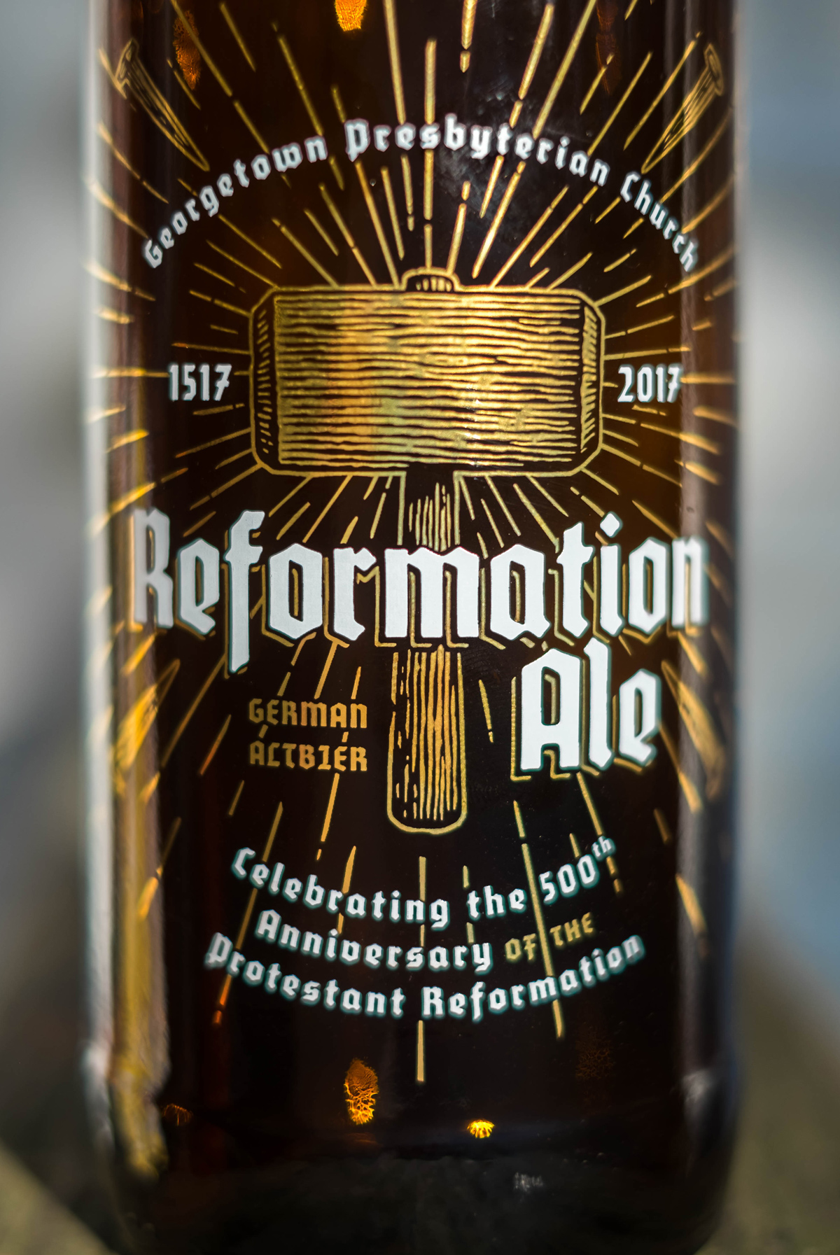
At the end of this month is the 500th anniversary of Martin Luther's 95 theses. To celebrate the milestone, Georgetown Presbyterian Church will host a hymnsong, and serve a special era-inspired German beer to honor the spirit of the reformers generally, but specifically honor Katie Luther - the wife of Martin. 

In case you cannot read the text above - 

In late October of 1517, a German monk named Martin Luther published a few ideas on theology - 95 to be precise. Though he guessed they might make for lively discussion, little did he know his these would spark a revolution - or rather a reformation.
A few years later Luther married another rebel, a nun-on-the-run named Katharina von Bora. "Katie" Luther wielded a dual reputation: for influence over her famed husband, and for brewing excellent ale. Many of the liveliest discussions of the Reformation took place in the Luther household, over several pints of Katie Luther's esteemed beer.
The discussion begun in 1615 continues today, five hundred years later. So raise a glass to Katie Luther and the Reformation." 

The quote at the bottom "Here I stand - I can drink no other." is a reference to Martin's mythical quote at the Diet of Worms in 1521.

This post represents a thank you to Georgetown Presbyterian Church, Ceramic Decorating Co. for supplying the glass and decoration at-cost, the illustrator Steven Noble who supplied the mallet and nails illustration.

Images by photographer Adrian Vaagnes.

tags: beer design, beer branding, beer packaging design, beer graphic design, beer bottle design, craft beer
categories: Design, Lettering, Non-Profit, Packaging Design, Personal
Sunday 10.15.17
Posted by Joshua Berman
Comments: 1
 

Friendly Press for King's Sandwich Shop

Image from News & Observer

Image from News & Observer

At the corner of Foster and Geer Streets just north of downtown Durham, North Carolina, you will find an unassuming cinderblock shed with red awnings and a Coca-Cola sign at least 50 years old. This is King's Sandwich Shop. Approaching its 75th anniversary, News & Observer ran an article on their latest venture: King's Mobile.

READ THE ARTICLE

I was fortunate enough to meet the owner of King's on one of my many walks to get a shrimp po boy with tater tots and fried okra, ( health shop they are not) and began working with him on a rebrand soon after. In addition to a new logo and identity system, a primary focus was on rolling out the #kingstream: a renovated airstream trailer that functions as the second location, as well as a catering vehicle and special event-mobile.

As the new work is rolled out I'll be updating the portfolio. For now, if you're ever in Durham, be sure to swing by and try a Cack-A-Lacky King or spicy black bean veggie burger.

Check out the pub here: http://www.newsobserver.com/entertainment/restaurants/article155104114.html

tags: restaurants, food and beverage, branding, logo design, script, lettering
categories: Branding, Design, Lettering, Logos
Friday 06.30.17
Posted by Joshua Berman
 

White Street Brewing Co. Announces Release of Emmalynn

Image courtesy of White Street Brewing Co.

Image courtesy of White Street Brewing Co.

Earlier this month All About Beer Magazine posted that White Street Brewing Company has announced the release of Emmalynn, their new Belgian Blonde. This will be part of their Main Street Series of beers, likely available year-round. I have designed all of the White Street Brewing Company work since day 1, and this one was especially fun. We took inspiration from the traditional lampposts, a north star of the White Street brand, that line some of their larger cities more well-known plazas. The waves of golden wheat speak to the primary ingredients in the beer, and lend a flowing visual texture to the medallion.

VIEW THE LINK

From the article...

“Emmalynn fits perfectly into the Main Street series. Each of our flagships is a crowd-pleasing, approachable example of a classic style that showcases the different aspects of the beer world. Kölsch (winner of the 2014 World Beer Cup Gold Award) is our light, crisp, clean beer; the Scottish Ale highlights the sweetness of malt-forward beers; Hoptimist boasts the bright, tropical aromas found in West Coast hops. Emmalynn is unique because she possesses flavors and aromas that show off the yeast and fermentation practices.”
— Ian VanGundy, Brewing Operations Manager at White Street

The state-wide release of the beer will be on September 12th, which is White Street's 4th anniversary: a fitting date for their fourth product in the Main Street Series lineup.

A few interesting articles featuring my work have surfaced recently, including White Street's Main Street series featured on Packaging of the World, Funky Buddha's Hop Gun IPA featured on BeerLabelsInMotion, and very recently SunUp Brewing Company's new can lineup featured on TheDieline. 

This is especially exciting for me, because it is the last package design I worked on for White Street as a team member of The Brandit. For those of you who don't know, left my position as Art Director of The Brandit in June. We still have a wonderful working relationship; I continue to provide brand strategy and art direction as they need, and hopefully I can continue to provide packaging design for White Street Brewing in this manner for years to come.

tags: white street, white street brewing co, white street brewing company, beer design, beer branding, beer packaging design, beer graphic design, beer bottle design, graphic design
categories: Branding, Design, Lettering, Packaging Design, The Brandit
Monday 08.29.16
Posted by Joshua Berman
 

White Street Brewing Co. Packaging Featured on Packaging of the World

Derrick Lin, Packaging of the World Chief Curator, posted The Brandit's packaging design for White Street Brewing Company's Main Street series of products today on the front page of packagingoftheworld.com. This is extremely exciting for me, as I've been working on White Street's brand for over 3 years.

VIEW THE LINK

Since these three products, Kolsch, Hoptimist IPA, and Scottish, rolled out in 2014, we've worked on four more brands. Koschei the Deathless was unveiled in 2014, and hopefully you can see some of the other new stuff in the marketplace soon. If you live in Raleigh-Durham, NC you should be able to find all these at any local grocery store.

tags: white street brewing company, white street, white street brewing co, beer packaging design, beer design, beer branding, beer graphic design, beer bottle design
categories: Packaging Design, The Brandit, Lettering
Tuesday 04.26.16
Posted by Joshua Berman
 
Newer / Older

WORK  |  ABOUT  |  BLOG  |  TESTIMONIALS  |  CONTACT  |  COPYRIGHT JOSHUA BERMAN 2016