• Work
  • About
  • Blog
  • Contact
Joshua Berman Design
  • Work
  • About
  • Blog
  • Contact

T-Shirt Design & Logo Roundup - Summer 2017

With the oppressive heat in full swing, it's time to break out your favorite tees. Apparel is not something of which I do an enormous amount, but it's always a good time. Here are a few of my favorites from the past several weeks/months/years.

Barley's Craft Pizza & Beer
Greenville, SC

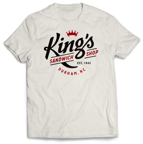
King's Sandwich Shop
Durham, NC

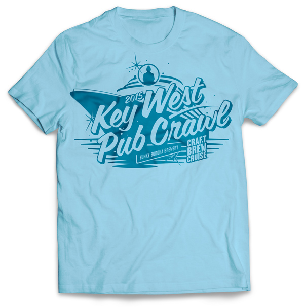
Key West Pub Crawl 2015
Funky Buddha Brewery
Oakland Park, Florida

Oconee Brewing Co.
Greensboro, Georgia

Euro-Awesome 2015
Personal Project

"Courage!"
Santa Maria Brewing Co.
Santa Maria, California

Hoke Family Reunion 2017
Cleveland, Ohio

King's Sandwich Shop
Durham, NC

Maple Bacon Coffee Porter Festival
Funky Buddha Brewery
Oakland Park, Florida

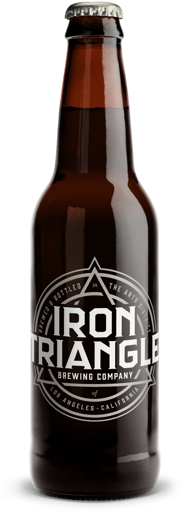
Iron Triangle Brewing Co.
Los Angeles, California

Silver Harbor Brewing Co.
Saint Joseph, Michigan

"Ales & Lagers"
Santa Maria Brewing Co.
Santa Maria, California


Funky Buddha, Barley's, Iron Triangle, Oconne, and Silver Harbor. were all done while I was at The Brandit, but not all of these shirts were ever produced. Sometimes it's fun to see what might have been.

tags: apparel, t-shirts, t-shirt design, beer, branding, beer design, beer branding, graphic design, custom t-shirts, custom t-shirt designs
categories: Apparel, Design, Illustration, The Brandit, Cutting Room Floor
Tuesday 07.25.17
Posted by Joshua Berman
 

Cutting Room Floor: Iron Triangle Brewing Co.

On occasion it's fun to go back and examine some work that didn't quite make the cut. Roughly a year ago, while an art director at The Brandit, I began working on an identity system for Iron Triangle Brewing Co. in Los Angeles. Thematically, they were very interested in the story of Milliam Mulholland, Fredrick Eaton, and Joseph Lippincot: the three men who built the LA aqueduct at the turn of the 20th century. They wanted to make sure that the imagery of the aqueduct was somewhat visible, or at least homaged in the creation of the artwork. Creating a suite of icons and logos was important, as well.

I ran across it an early version of the identity system that didn't make it past the second round, and thought it was really cool. The name "Iron Triangle" combined with the imagery of an aqueduct made for a conceptual challenge, and the linkage of two strong geometric shapes is an elegant way to square, or triangle, that circle. Negative space at the linking points creates a swirling effect, reminiscent of water propelled through a tube.

 
iron_triangle.jpg


“William Mulholland was a self-educated man, but in 1914 the University of California at Berkeley bestowed on him an honorary doctorate degree. The inscription on the diploma read ‘Percussit saxa et duxit flumina ad terram sitientum’ (He broke the rocks and brought the river to the thirsty land).”
— IrishAmerica.com


During the research phase, we found this interesting bit about William Mulholland. The inscription is wrapped around the tertiary logo, which was intended as an interesting button, or perhaps even embossed on the bottom of the bottle if we pursued custom glassware. One version utilized the original latin, for even more classic character. The secondary logo feels the most like swirling water, and was to be used as the crown.

The identity system works especially well on black.

tags: beer design, beer, beer branding, beer graphic design, craft beer
categories: Cutting Room Floor, Logos, The Brandit
Wednesday 07.12.17
Posted by Joshua Berman
 

A Wild Emmalynn Appeared!

Image courtesy of Josh's old cell phone. Pardon the lack of focus.

Image courtesy of Josh's old cell phone. Pardon the lack of focus.

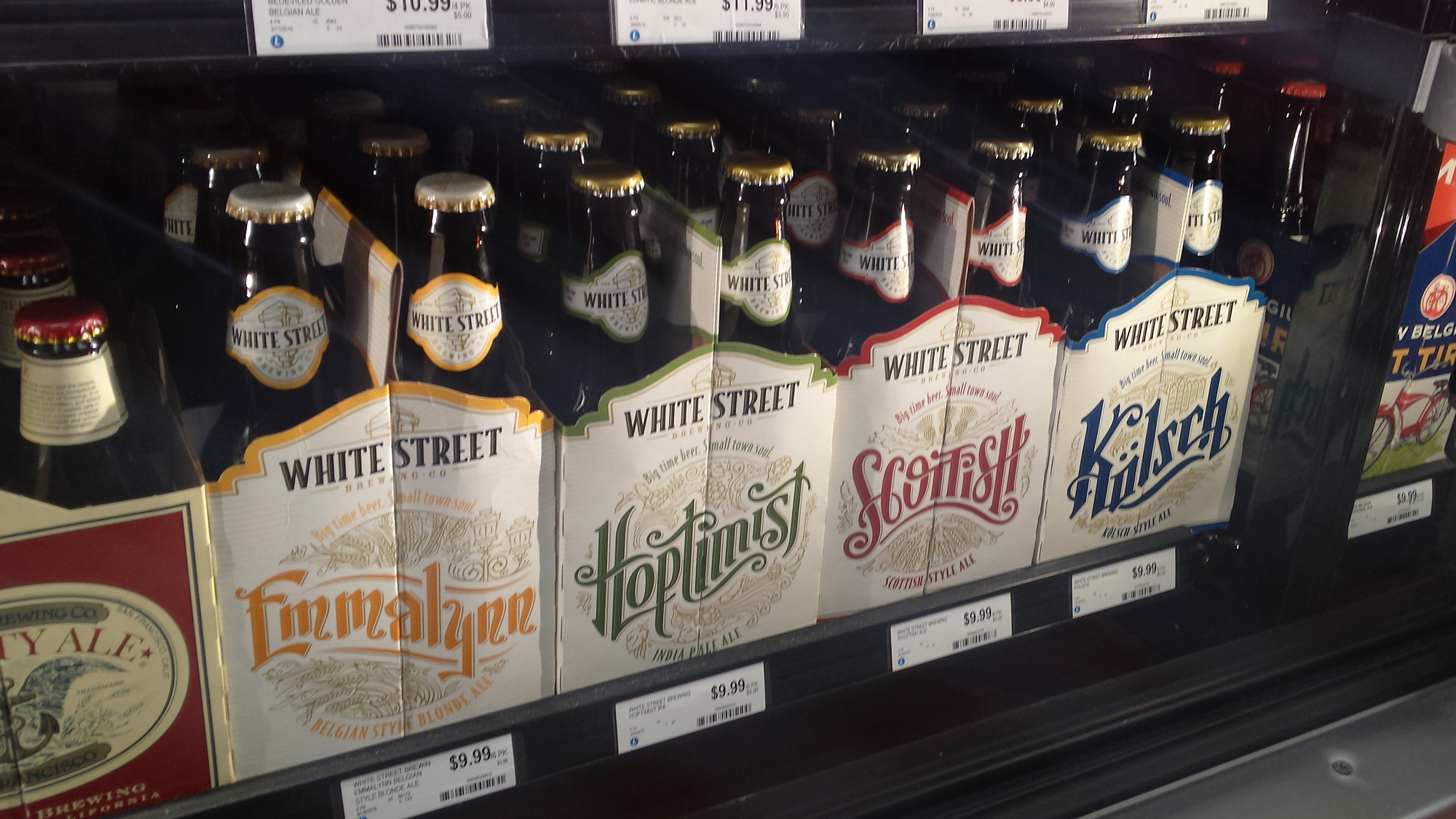
Here's a quick update on the Emmalynn post from the end of August.

Last week I was down in Durham, NC and spotted all four year-round White Street packages the way they were meant to be: in a row. This shelf is courtesy of Weaver Street Market in Carborro.

tags: beer design, beer branding, beer packaging design, beer graphic design, beer bottle design, craft beer, white street, white street brewing co, white street brewing company
categories: Branding, The Brandit, Packaging Design
Monday 10.31.16
Posted by Joshua Berman
 

White Street Brewing Co. Announces Release of Emmalynn

Image courtesy of White Street Brewing Co.

Image courtesy of White Street Brewing Co.

Earlier this month All About Beer Magazine posted that White Street Brewing Company has announced the release of Emmalynn, their new Belgian Blonde. This will be part of their Main Street Series of beers, likely available year-round. I have designed all of the White Street Brewing Company work since day 1, and this one was especially fun. We took inspiration from the traditional lampposts, a north star of the White Street brand, that line some of their larger cities more well-known plazas. The waves of golden wheat speak to the primary ingredients in the beer, and lend a flowing visual texture to the medallion.

VIEW THE LINK

From the article...

“Emmalynn fits perfectly into the Main Street series. Each of our flagships is a crowd-pleasing, approachable example of a classic style that showcases the different aspects of the beer world. Kölsch (winner of the 2014 World Beer Cup Gold Award) is our light, crisp, clean beer; the Scottish Ale highlights the sweetness of malt-forward beers; Hoptimist boasts the bright, tropical aromas found in West Coast hops. Emmalynn is unique because she possesses flavors and aromas that show off the yeast and fermentation practices.”
— Ian VanGundy, Brewing Operations Manager at White Street

The state-wide release of the beer will be on September 12th, which is White Street's 4th anniversary: a fitting date for their fourth product in the Main Street Series lineup.

A few interesting articles featuring my work have surfaced recently, including White Street's Main Street series featured on Packaging of the World, Funky Buddha's Hop Gun IPA featured on BeerLabelsInMotion, and very recently SunUp Brewing Company's new can lineup featured on TheDieline. 

This is especially exciting for me, because it is the last package design I worked on for White Street as a team member of The Brandit. For those of you who don't know, left my position as Art Director of The Brandit in June. We still have a wonderful working relationship; I continue to provide brand strategy and art direction as they need, and hopefully I can continue to provide packaging design for White Street Brewing in this manner for years to come.

tags: white street, white street brewing co, white street brewing company, beer design, beer branding, beer packaging design, beer graphic design, beer bottle design, graphic design
categories: Branding, Design, Lettering, Packaging Design, The Brandit
Monday 08.29.16
Posted by Joshua Berman
 
Newer / Older

WORK  |  ABOUT  |  BLOG  |  TESTIMONIALS  |  CONTACT  |  COPYRIGHT JOSHUA BERMAN 2016