• Work
  • About
  • Blog
  • Contact
Joshua Berman Design
  • Work
  • About
  • Blog
  • Contact

Union Press & Paper featured in Southern Weddings

Sarah Almond is a friend of mine here in Durham, who owns Union Press & Paper. The shop was recently featured in Southern Weddings: http://southernweddings.com/vendor/union-press-paper/

(Apologies for the delayed news, I'm attempting to catch up on some blogposts from the past - oh, I don't know - two years.)

categories: Uncategorized
Monday 10.05.15
Posted by Joshua Berman
 

TabSprint

The past few months have been reasonably busy, probably because most spare moments are assigned to Durham startup and my most recent venture: TabSprint.

TabSprint is a mobile app that lets you pay for your drinks on your phone. We do this by circumventing the Point-of-Sale (POS), which is the computer into which servers and bartenders have to type your order.

  1. Select your menu items on the app
  2. Show your order to the bartender, and swipe.
  3. When the bartender sees a confirmation screen, they hand you your drinks. And you never have to close out your tab at the end of the night. Simple as that.

TabSprint App | Ordering Screen

blog_tabsprint_app
blog_tabsprint_app

Currently, more than 60% of the time it takes a bartender to fill a drink order is spent behind the POS. TabSprint eliminates that step. All inventory and billing is handled on the backend, so the bartender never has to mess with that either. They spend their time doing what they do best: making drinks and chatting with patrons.

Prototype of In-Bar Signage

blog_tabsprint_sign
blog_tabsprint_sign

Additional features include app credits you can put towards purchasing menu items for getting your friends to sign up, as well as listing all local drink specials on the landing screen of the app.

Earlier this summer we finished our stint in The Startup Factory (which was then Triangle Startup Factory), which is a 3-month intensive incubator. Since launching V2.0 of our product less than a month into the program, TabSprint is in over 30 venues, with 500 new users and 1,000 drinks sold in the last 30 days.

The Team | John, Grant, and Lucas

blog_tabsprint_guys
blog_tabsprint_guys

TabSprint Links

  • Here we are on Facebook.
  • Over at the TabSprint blog, I wrote an article featuring five of my current favorite beer brands, pertaining to identity and packaging design. You can view that here: https://www.tabsprint.com/blog/2013/09/12/5-best-craft-beer-brands/
  • The Startup Factory | Durham, NC

I'll be adding some more images to the portfolio section of the site eventually, showing more app screens, icon suites, etc., but this will do for now.

Investors

We are in the process of raising a seed round. If you are interested in getting in on the ground floor of TabSprint, please connect with our CEO John Chipouras here or email him here.

categories: Apps, Design
Sunday 10.20.13
Posted by Joshua Berman
 

The Brandit Updates

new_blogpost.png

You might recall an article I posted about moving from Nickelfish to the The Brandit in early 2012. Well, much has happened at The Brandit since then, the most visually significant of which might be the identity update implemented this spring.

The Brandit character evolved darkly, switching from a fun, primary, geometric dude to a much more stylized, vigilante-esque charater. The new website also reflects the brand update.

Almost all of the work I've done in the past year has been with The Brandit. Some of my favorite projects include Hello IT, Vizcaya Villa and the logo for St. Florian's Brewing Company; you can peruse the WORK page to see some of the other stuff we've put out recently.

All the new art is the primary reason this website hasn't been updated in a while, but now is the time to change that.

I recently added a couple new project pages to my portfolio, and two of my favorites are Lauryl Lane (who I've written about before, and whose case study you can read here) and Mile High Style, two stylists who have already seen excellent mileage from their identity overhauls.

Three weeks ago, Dan (Creative Director at The Brandit) and I went to the Craft Brewers Conference. It was the first experience for both of us, and we had a great time. We made a ton of great contacts in the industry, and hope to begin working with some craft brewers, startups and old standards alike, to develop their brand identities.

Stay tuned to see some work from that industry in the coming months.

categories: Branding, The Brandit, Updates
Wednesday 04.24.13
Posted by Joshua Berman
 

Case Study: Lauryl Lane

Lauryl Lane is a high-end floral designer and stylist in Los Angeles, California. Her clients range from fashionista brides to Hollywood royalty. After making a strong name for herself in California, on the basis of her exquisite work, it was time to update her online presence.The Brief

The initial project was actually a simple website redesign, but upon examining some important factors I decided to begin discussing a full identity update. Lane needed something special to distinguish her from any number of florist shops, the kind that make most of their money on Valentines day, and run-of-the-mill event stylists, who may or may not be wedding coordinators with good creative contacts. What sets Lane apart is her use of florals in everything she does, and she does do everything. A floral designer by training, the flowers are the centerpiece of her events and photoshoots.

Before addressing visual style, I embraced her singular combination of offerings (floral design in event styling) to make her brand proposition equally one-of-a-kind. I wanted to keep Lauryl's name as the title, since she has quite a reputation, but supplement it with a tagline as unique as her services, and the term Botanical Stylist was born.

The quick subtitle is elegant, meaningful, and holds enough mystery for someone to perhaps ask for a fuller definition, which would allow Lane to explain her exclusive mixture of talents. To our knowledge there is no other botanical stylist in the United States, and we are taking the appropriate measures to protect this brand element on the web.

Having secured the text, it was time for the type.

Creative Development

For the actual logotype, the client wanted to stay within the calligraphy range, and we turned to the same talented artist who provided Lane's first logo: Victoria Hoke Lane, the client's mother.

The old logo, while attractive, was created a while ago and had a unique purpose: to describing the services visually. With the new subtitle, these illustrations became superfluous. Also, since our target market is decidedly high-end, the old logo, while executed nicely, was not the right style.

Old Logo

lauryl_lane_logo_old

New Logo

lauryl_lane_logo_new

I modified the calligraphy slightly to accommodate the important subtitle. The new logo is elegant and clean, displaying the correct tone of voice for Lauryl's updated brand.

Website

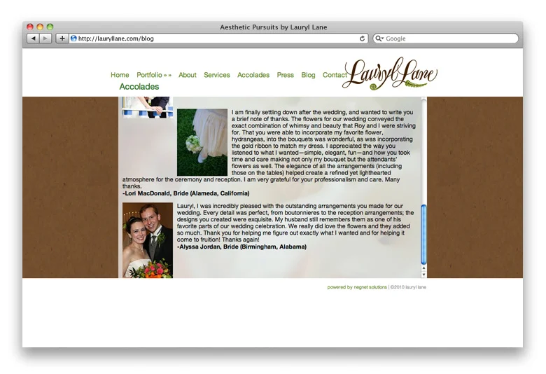
Like the original logo, Lane's original website was very heavy on the literal translation of the floral industry: lots of textures and background prints and browns and greens. Taking a less-is-more approach, I decided to let Lane's work speak for itself, and minimize the amount of distracting background elements.

Old Website

lauryl_lane_web_old_1
lauryl_lane_web_old_2
lauryl_lane_web_old_3

New Website

jbd_web_work_web_lauryl_1
jbd_web_work_web_lauryl_2
jbd_web_work_web_lauryl_4
jbd_web_work_web_lauryl_3

There is still a fair bit of color, but the elements have been simplified and more white space allows the stunning images to take center stage. Not only is the work more elegantly displayed, but the information is streamlined. Cutting down navigation items (in this case from 8 to 5) is usually a challenge, but well worthwhile since most site visitors just want to see the work.

Lane also takes many of her own photographs, and wanted to protect them with a watermark. A simple button combining the two "l"s from her name is the perfect solution.

ll
ll

There are some new collateral elements planned for the future, like letterpress business cards and such, but Lauryl Lane has already taken an enormous step forward by updating her web-presence.

Here is the new website.

categories: Case Studies
Tuesday 12.11.12
Posted by Joshua
 
Newer / Older

WORK  |  ABOUT  |  BLOG  |  TESTIMONIALS  |  CONTACT  |  COPYRIGHT JOSHUA BERMAN 2016