• Work
  • About
  • Blog
  • Contact
Joshua Berman Design
  • Work
  • About
  • Blog
  • Contact

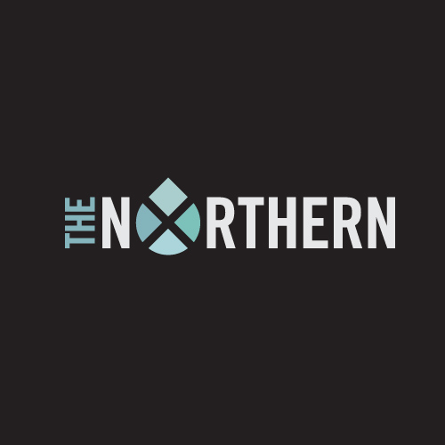
The Northern Logo

Graham Gibson, Jon Ho, Aaron Craig, David Chalk are musical group The Northern. This Manhattan rock and roll quartet of misplaced Texans releases their new album, The Shadowlands, on June 15th in NYC. If you are interested in going, check out their respective webbed sites for more information:

jbd_blog_the_northern_logo

The Northern on Twitter: twitter.com/thenorthernnyc The Northern on the Web: thenorthern.com/ The Northern on Facebook: facebook.com/TheNorthernMusic

On their blog you can see this new post about the logo. I had better get a shirt or something for this.

The Shadowlands releases on iTunes June 19th.

categories: Logos
Wednesday 05.16.12
Posted by Joshua Berman
Comments: 1
 

Catch the Moment: Part 2

I wanted to followup yesterday's post about the creative process with a few more concepts I did for Catch the Moment. Again, none of these were selected, but I like taking a look at the work that was done to see if there is any merit in it.

jbd_blog_ctm_4.png

Throughout most concepts I wanted to retain either an element of "fun" or "film." Catch the Moment provides their services at events, and records the special memories on film, so the intersection of the two is what I wanted to capture. (Hence the old Hollywood logo from the last post.)

jbd_blog_ctm_3.png

The vintage movie theater sign above alluded to classic film, and the bright, fun color scheme below allowed for a little more flexibility.

jbd_blog_ctm_2.png

At the end of the day, the client wanted a more contemporary approach than the vintage stylings I had through my early concepts. This "filmstrip" concept was a contender, but not a finalist.

jbd_blog_ctm_1.png

And there you go: more interesting concepts left on the cutting room floor (pun very much intended.)

categories: Logos, NFIDM, Process, Cutting Room Floor
Wednesday 05.02.12
Posted by Joshua
 

Catch the Moment: Logo Design Process

Catch the Moment is an "Event Photo Entertainment" service, specializing in green screen video booths at large corporate events. As a client of NFIDM, I began working on the logo portion of their rebrand. This post, however, is not about the full identity development. On the whole, strategy and concept decisions are more important to brand development than creative execution, but I wanted to show a step-by-step artistic review of my execution process as well. Here are the visual steps I used to create a "Catch the Moment" logo concept, which is pretty indicative of my normal logo design process.

Note: Catch the Moment did not choose this direction for their final logo. You can see the artwork they selected by visiting their website. Zaib Malik designed the final mark; I have referenced him before in this post.

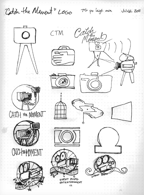
92% (or so) of the time I will begin by sketching with pen on paper. If I'm in a rush, I sometimes don't start on paper, but then I just end up wasting time on the computer for a few hours, and go back to paper anyway, wishing I had just started there. Maybe I should have learned my lesson by know. Anyway, here are some intial sketches.

Initial Sketches

catchthemoment_logo_1

After a few concepts, I settled on an old video camera as the image, and wanted to utilize a vintage Hollywood style.

catchthemoment_logo_2

Defining specific lines and forms is not as important to me in the sketching phase as figuring out how the whole image will work together. Composition, as well as general visual style, is really what I want to figure out while I'm in the sketching phase. This particular logo was really well described in the sketch phase, even more detailed than usual, so the next steps were relatively quick.

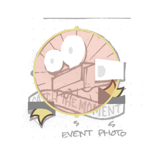
Shape out the Area

catchthemoment_logo_3
catchthemoment_logo_4

Note: Notice how in this phase I dropped the "button" that was on the left hand side of the circle. Often I will loose superfluous elements when going from sketch phase to illustration, but in this case I might have just forgotten about it. Oh well.

Do the lineart

catchthemoment_logo_5

Balance Elements / Text

catchthemoment_logo_6
catchthemoment_logo_7

Experiment with Colors

catchthemoment_logo_8

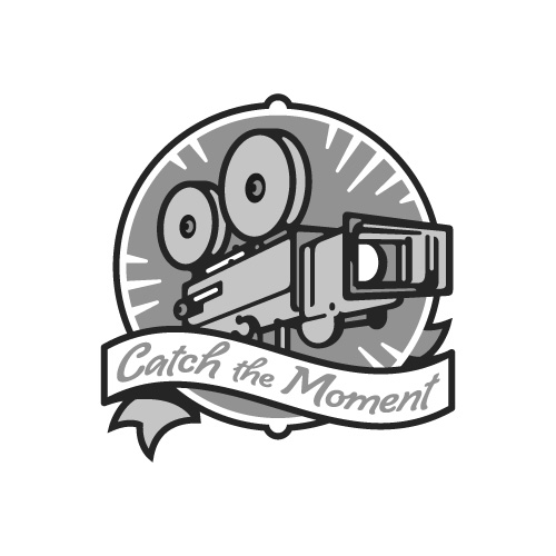
If I have a difficult time picking a color scheme, sometimes I will reduce the illustration to a greyscale version just to see where I want my darkest and lightest values. After I get this to work the way I like, I can easily explore schemes with the appropriate lightness and darkness.

Greyscale Version

catchthemoment_logo_10

Final Colors

catchthemoment_logo_11

All in all I am quite happy with how the final logo turned out. The colors and illustration style work together to create a fun, vintage tone. Although this particular brand would likely only exist online or in digital media, I felt compelled to create a couple simplified permutations of the logo in case of unexpected black and white printing from a desktop printer or similar situation.

Greyscale Variant

catchthemoment_logo_12

Single Color

catchthemoment_logo_13
categories: Illustration, Logos, NFIDM, Process
Monday 04.30.12
Posted by Joshua
 

Anchor Apologetics Logotype Design

Nautical theme ahoy for this logotype and icon suite. Personally, I am a big fan of clean, geometric shapes paired with natural textures.

Read more

categories: Design, Logos
Wednesday 02.22.12
Posted by Joshua
Comments: 3
 
Newer / Older

WORK  |  ABOUT  |  BLOG  |  TESTIMONIALS  |  CONTACT  |  COPYRIGHT JOSHUA BERMAN 2016