Lauryl Lane is a high-end floral designer and stylist in Los Angeles, California. Her clients range from fashionista brides to Hollywood royalty. After making a strong name for herself in California, on the basis of her exquisite work, it was time to update her online presence.The Brief
The initial project was actually a simple website redesign, but upon examining some important factors I decided to begin discussing a full identity update. Lane needed something special to distinguish her from any number of florist shops, the kind that make most of their money on Valentines day, and run-of-the-mill event stylists, who may or may not be wedding coordinators with good creative contacts. What sets Lane apart is her use of florals in everything she does, and she does do everything. A floral designer by training, the flowers are the centerpiece of her events and photoshoots.
Before addressing visual style, I embraced her singular combination of offerings (floral design in event styling) to make her brand proposition equally one-of-a-kind. I wanted to keep Lauryl's name as the title, since she has quite a reputation, but supplement it with a tagline as unique as her services, and the term Botanical Stylist was born.
The quick subtitle is elegant, meaningful, and holds enough mystery for someone to perhaps ask for a fuller definition, which would allow Lane to explain her exclusive mixture of talents. To our knowledge there is no other botanical stylist in the United States, and we are taking the appropriate measures to protect this brand element on the web.
Having secured the text, it was time for the type.
Creative Development
For the actual logotype, the client wanted to stay within the calligraphy range, and we turned to the same talented artist who provided Lane's first logo: Victoria Hoke Lane, the client's mother.
The old logo, while attractive, was created a while ago and had a unique purpose: to describing the services visually. With the new subtitle, these illustrations became superfluous. Also, since our target market is decidedly high-end, the old logo, while executed nicely, was not the right style.
Old Logo
New Logo
I modified the calligraphy slightly to accommodate the important subtitle. The new logo is elegant and clean, displaying the correct tone of voice for Lauryl's updated brand.
Website
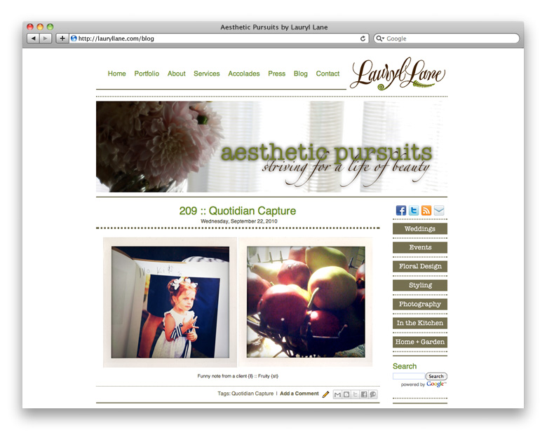
Like the original logo, Lane's original website was very heavy on the literal translation of the floral industry: lots of textures and background prints and browns and greens. Taking a less-is-more approach, I decided to let Lane's work speak for itself, and minimize the amount of distracting background elements.
Old Website
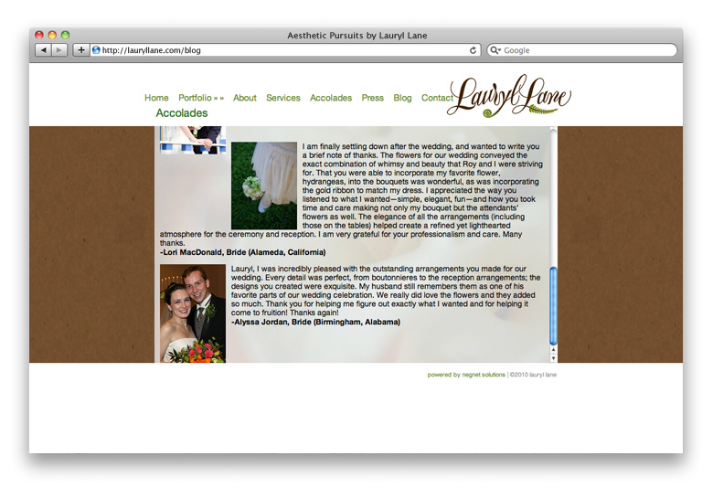
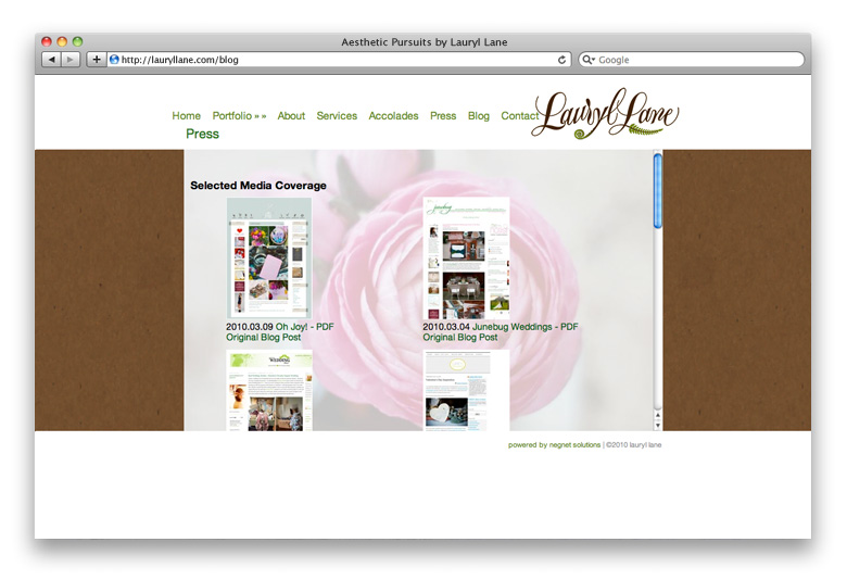
New Website


There is still a fair bit of color, but the elements have been simplified and more white space allows the stunning images to take center stage. Not only is the work more elegantly displayed, but the information is streamlined. Cutting down navigation items (in this case from 8 to 5) is usually a challenge, but well worthwhile since most site visitors just want to see the work.
Lane also takes many of her own photographs, and wanted to protect them with a watermark. A simple button combining the two "l"s from her name is the perfect solution.

There are some new collateral elements planned for the future, like letterpress business cards and such, but Lauryl Lane has already taken an enormous step forward by updating her web-presence.
Here is the new website.